CSS で円をぼかして作るグラデーション
はじめに
Instagram で面白いグラデーションの作り方を見つけました。この作り方によるグラデーションは、2021 年に入りよく見かけます。
一般的に CSS でグラデーションを作るには、linear-gradient()・radial-gradient()・conic-gradient() を使用します。しかし、上記 Instagram のグラデーションは、複数の円を filter: blur() でぼかして作ります。
このぼかして作るグラデーションを可能な限り簡単に実現する CSS を考えてみました。
デモ
実際のデモをご覧ください。
デモの HTML です。今回は 4 つの円を作ります。
 <div class="box">
  <div class="circle a"></div>
  <div class="circle b"></div>
  <div class="circle c"></div>
  <div class="circle d"></div>
</div>
デモの CSS です。パソコンで見てもスマホで見ても同じグラデーションになるようにしました。
 .box {
  --box-width: min(80vw, 400px);

  aspect-ratio: 16 / 9;
  background: #fff;
  border-radius: 16px;
  overflow: hidden;
  position: relative;
  width: var(--box-width);
}

.circle {
  aspect-ratio: 1 / 1;
  border-radius: 50%;
  filter: blur(calc(var(--box-width) / 10));
  position: absolute;
}

.circle.a {
  background: #88077e;
  left: -30%;
  top: -70%;
  width: 90%;
}

.circle.b {
  background: #fbb835;
  right: -10%;
  top: -85%;
  width: 80%;
}

.circle.c {
  background: #fd6444;
  bottom: -50%;
  right: -15%;
  width: 70%;
  z-index: 1;
}

.circle.d {
  background: #5158dd;
  bottom: -80%;
  left: -15%;
  width: 70%;
}
解説
CSS を解説します。
まずは、ボックスを作ります。background-color は、白と明示します。特にダークモードに対応している場合は、指定が必要だと思います。
 .box {
  --box-width: min(80vw, 400px);

  aspect-ratio: 16 / 9;
  background: #fff;
  border-radius: 16px;
  overflow: hidden;
  position: relative;
  width: var(--box-width);
}
次に、ボックスの中に 4 つの円を描きます。デモでは、左上から時計順に <div> を配置しています。
 .circle {
  aspect-ratio: 1 / 1;
  border-radius: 50%;
  position: absolute;
}

.circle.a {
  background: #88077e;
  left: -30%;
  top: -70%;
  width: 90%;
}

.circle.b {
  background: #fbb835;
  right: -10%;
  top: -85%;
  width: 80%;
}

.circle.c {
  background: #fd6444;
  bottom: -50%;
  right: -15%;
  width: 70%;
  z-index: 1;
}

.circle.d {
  background: #5158dd;
  bottom: -80%;
  left: -15%;
  width: 70%;
}
最後に、4 つの円に filter プロパティを指定します。値に指定するのは、blur() です。親要素であるボックスの width の値の 10 分の 1 を blur() に指定しました。
 .circle {
  filter: blur(calc(var(--box-width) / 10));
}
linear-gradient() や radial-gradient() の 重ね合わせ に似てはいますが、独特なグラデーションの完成です。
色の調整
先程のデモの blur() の値を blur(calc(var(--sample-width) / 5)) と 2 倍にしてみます。より円の輪郭がぼけますが、色がくすんで見えます。
「円の輪郭はぼかしたいけど、くすんだ色は嫌だ」という場合は、filter プロパティに値を追加し調整するといいかもしれません。例えば、contrast() を追加してみます。
 .circle {
  filter: blur(calc(var(--box-width) / 5)) contrast(2.4);
}
contrast() の指定で、どれほど変わるか比較してみます。
contrast() なしcontrast() あり最初のデモと比較してみます。
blur() の値を大きくし、 contrast() も指定filter プロパティの調整で好みのグラデーションを作れます。
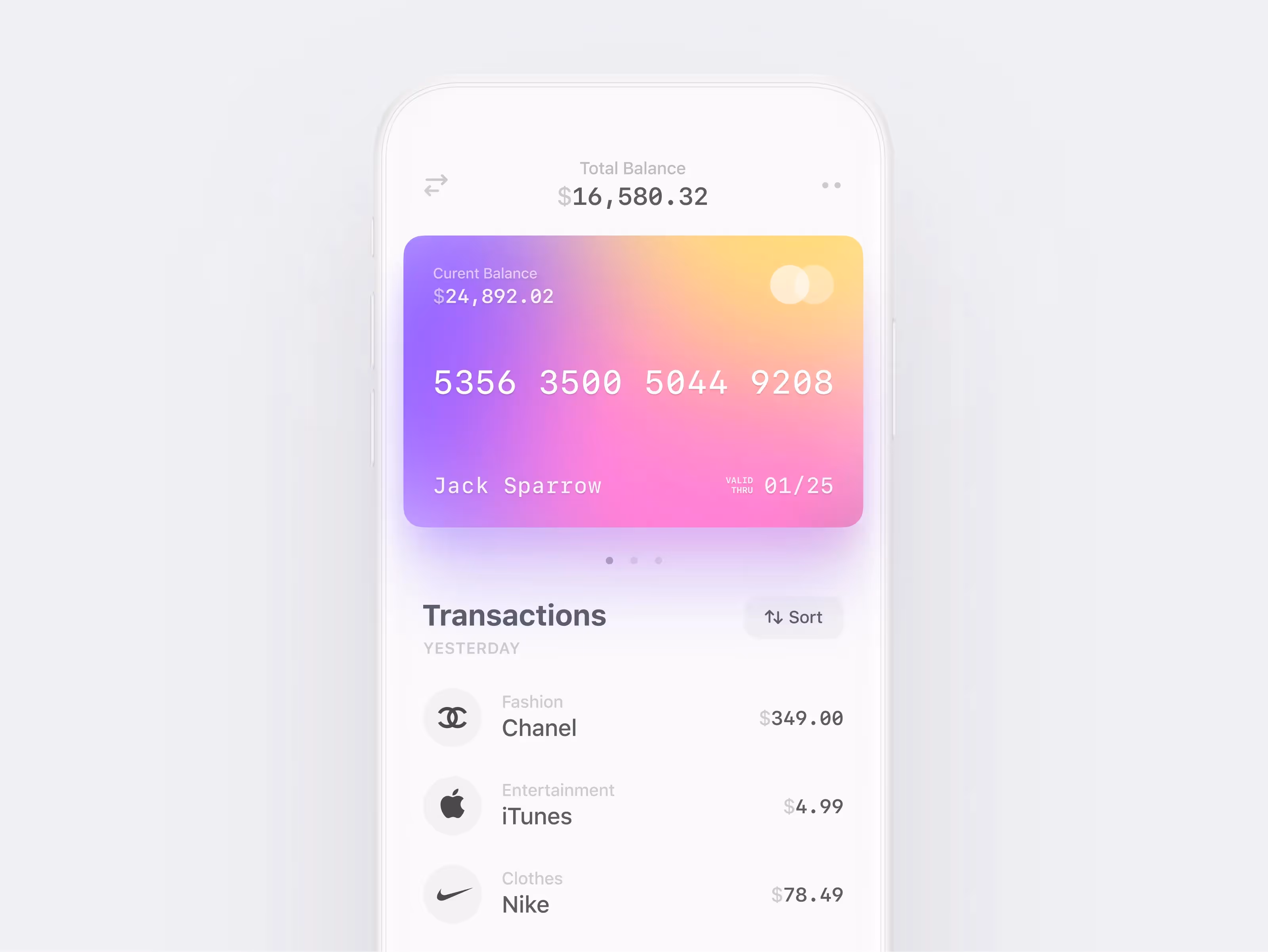
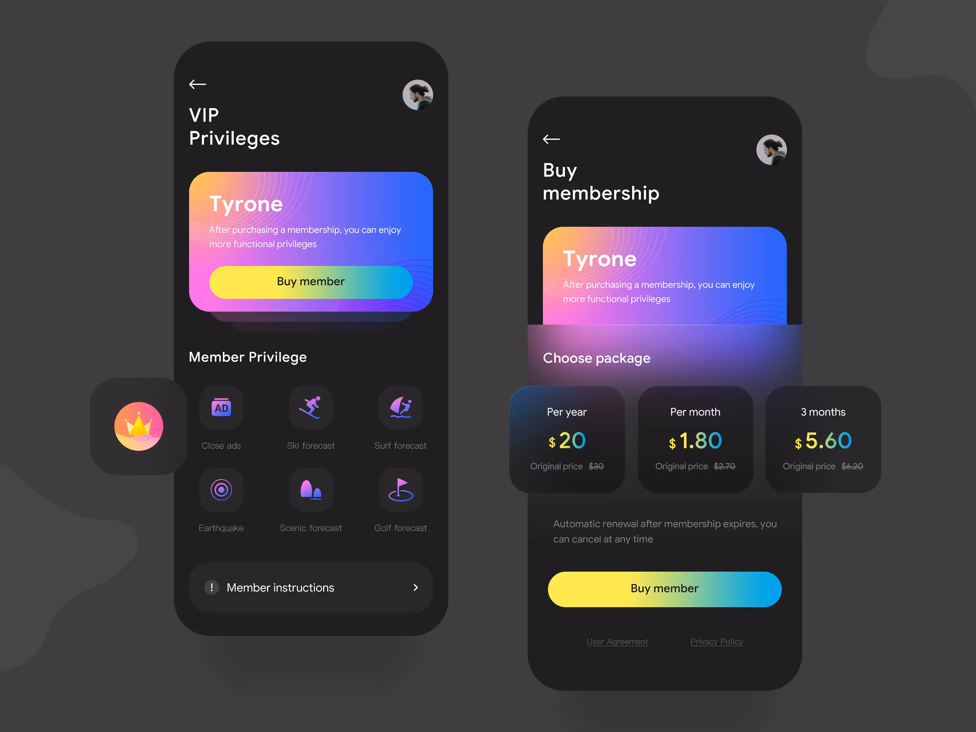
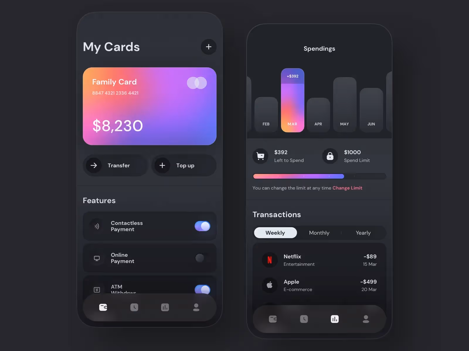
参考デザイン
Dribbble から参考になりそうなグラデーションを用いたデザインをいくつか集めました。グラデーションの重ね合わせでの表現が適しているデザインもあります。重ね合わせは Mesher Tool で簡単に作れます。Mesher Tool の使い方は、Mesher Tool の使い方 をご参考ください。